My time with server 2012 and metro
Over the past week, I spent my free time installing the new suite of Microsoft products onto my home VMware environment. I like to be ahead of the curve when it comes to new technology and software. I was an early adopter of Vista (unfortunately) and Windows 7 (just to escape Vista). Once I read about the preview release of Exchange 2013, I had to give it a spin.
The installation
I ran into a few issues getting the new Server 2012 operating system to work on my fully-updated ESXi 5u1 environment. Windows Server would start installing, but then stall after the first reboot. I was able to fix the issue by adding these lines to the *.vmx files for my new VMs via SSH/vi:
hypervisor.cpuid.v0 = FALSE mce.enable = TRUE vmGenCounter.enable = FALSE
Installation was fast onto my SSD-based datastore. I obtained my evaluation copies from Microsoft directly. I would recommend at least 4 cores for Exchange 2013 on Server 2012, as it was hitting 100% CPU usage on my original 2-core VM. A fresh Server 2012 install takes up about 12GB of space without any roles or features installed (except for telnet). As a note for anyone at Microsoft reading this: not including telnet in the default installation is an egregious offense.
I set up one Server 2012 server as a domain controller with DNS, another Server 2012 server as my Exchange 2013 member server, and a Windows 8 workstation with Outlook 2013 as a client. I used all IPv6 for my networking, and used my favorite StartSSL wildcard certificate to set up SSL. I also used my Ubuntu-based Linode VPS to relay SMTP for me, since port 25 is blocked by my residential ISP.
With the dcpromo command completely removed in Server 2012, I had to use the Roles/Features wizard (the Roles wizard and Features wizard are now combined) to add DNS and Active Directory Domain Services to my DC. I added a few necessary DNS records and then added my Exchange 2013 and Windows 8 VM to the domain. Finally, I installed Exchange 2013 onto my Server 2012 box, which required a couple of restarts and the manual uninstallation of the latest Visual C++ runtimes.
Issue 1: Hot corners don’t work
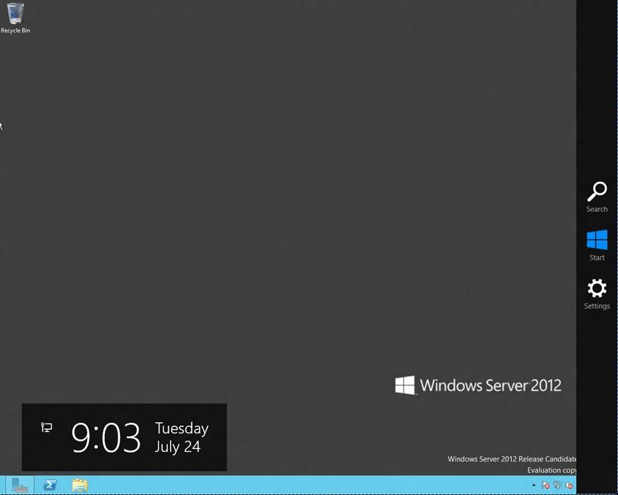
While configuring my domain and my Exchange server, I ran into my first major issue with Server 2012: hot corners. By moving my mouse to the top-right corner of the screen, I’m able to activate the hot corner, which brings up the new menu:
The issue with the hot corner design is that it doesn’t work in environments where the corners aren’t fixed. If you’re actually sitting at a physical server with a single monitor attached to it, hot corners are easy to use. Unfortunately, it’s 2012, and I can’t remember the last time I actually had to plug a monitor into a server. When I’m connected to my server via iLO, or RDP, or the VMware console, I can’t easily move my mouse into the corner of the screen, because my mouse can leave the window entirely. I am almost tempted to uninstall the VMware Tools just to lock my cursor inside the window.
The supposed answer to this issue is the Windows key, which drops you right into the new menu without using your mouse. The Windows key works, if I wanted to use my keyboard. Being able to navigate Windows with just a mouse is now incredibly difficult. This is a feature that was present in every preceding version of Window Server. I don’t understand why the addition of the hot corner has to preclude the existence of the Start button. Why not provide both options? The hot corners require more mouse movement and precision than a Start menu, and provides fewer benefits.
Hot corners were not designed with a mouse in mind, but I can guarantee you that 99.99% of all servers are not managed via touch. Server OS design needs to be mouse-centric, and the focus on touch negatively affects every admin. The fact that there is no “Classic” option makes it clear that Metro is here to stay, regardless of how negative its impact will be. Server 2008 brought a lot of UI changes with it, but they weren’t forced on us and I know a lot of admins that preferred Classic mode. Server 2012 brings changes that are even more dramatic with no chance to opt-out.
Issue 2: Side-to-side scrolling
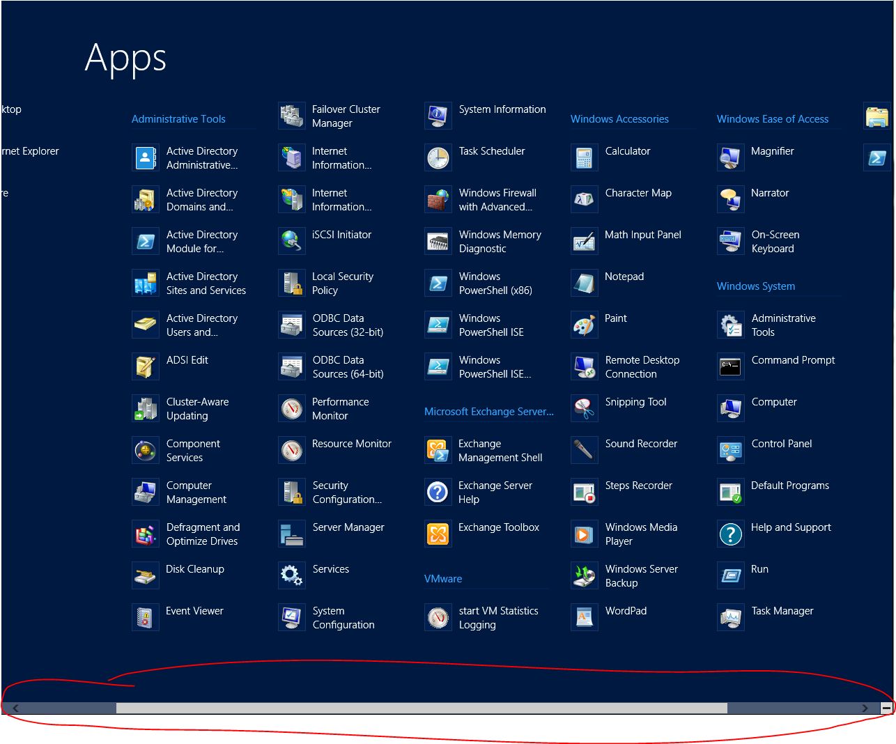
In the new metro menus, Microsoft has replaced the typical up-down scrolling system with side-to-side scrolling, for no apparent reason.
Scrolling has been up-down since its origin, and even the physical wheels on our mouse match this design. We have PgUp and PgDown buttons on our keyboards, not PgLeft and PgRight. There are several menus that scroll side-to-side in Server 2012, and it’s disconcerting. In addition, using the scroll wheel here is painfully slow.
Perk 1: A dramatically improved System Manager
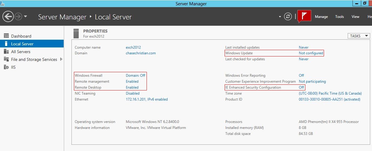
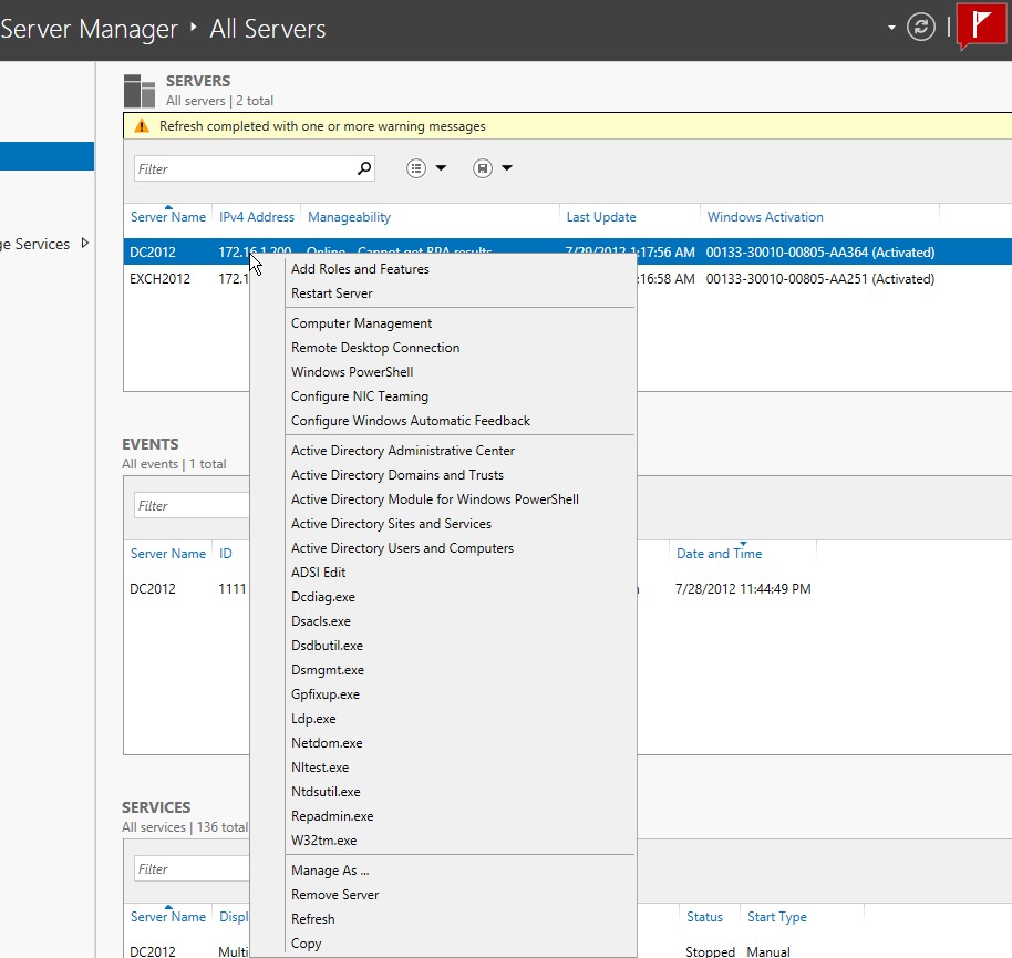
The new System Manager in Server 2012 is dramatically improved. My favorite feature is the landing page, which provides you with quick access to some of the most common administrative tasks:
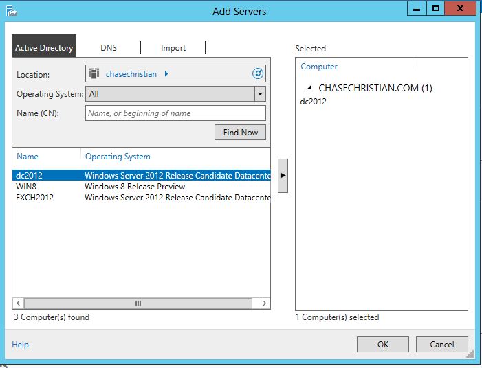
I love the plethora of information that’s easily available here. It makes it very easy to spot-check servers to ensure everything is set up properly. In addition, the new System Manager is clearly designed to manage multiple servers quickly and efficiently. It’s easy to add and maintain servers:
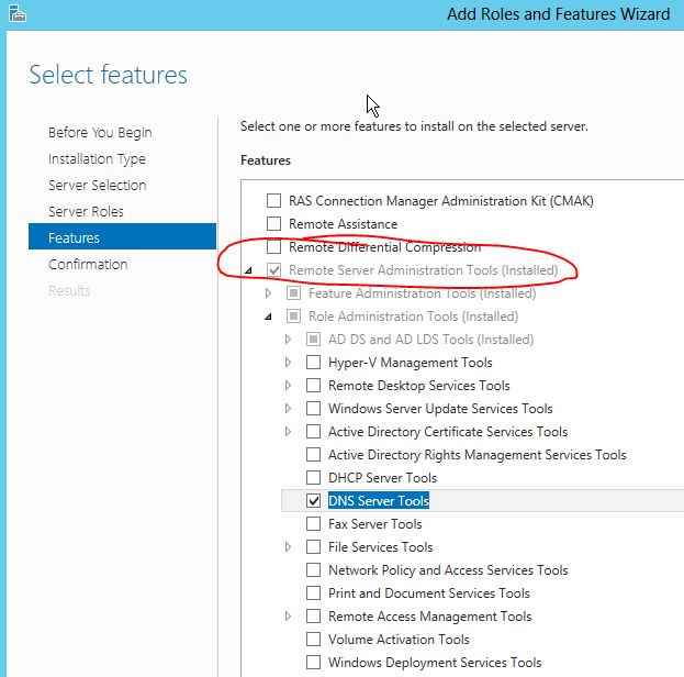
I am pretty impressed by how easy it was to use a single System Manager to manage multiple servers. To make it even easier, RSAT options are now available without any downloads necessary:
Perk 2: Built-in IP address management (IPAM)
I have been looking for a good IPAM solution for years, and Microsoft answered the call. Their new IPAM modules allow you to plug into your existing Windows DHCP and DNS servers to manage all of your subnets. You can easily provision new scopes and globally document statically assigned IPs without relying on a Google Docs spreadsheet.
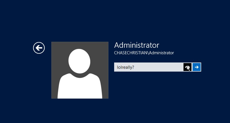
Issue 3: The “show password” button
I can’t think of any good reason for this button to exist, and I have to assume that it’s at least as insecure as including telnet by default:
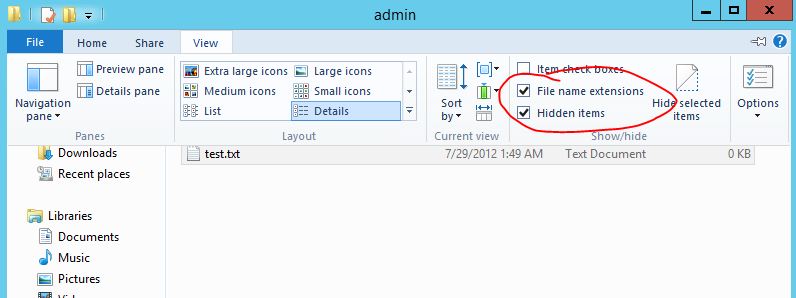
Perk 3: The new file management options
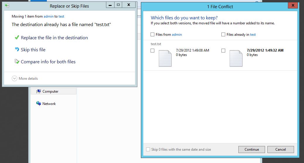
The new copy/paste dialogs and the shortcuts in the file manager are welcome improvements from the older versions of Windows:
These features are especially useful for consolidating folders filled with various pictures.
Issue 4: Where did Network Settings go?
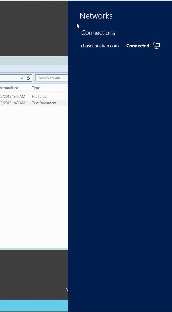
I was pretty upset when I couldn’t click on my networking icon in the system tray to change my IP address. The new Network and Sharing Center is completely useless, but yet it adds another hoop that I have to jump through in order to get to my adapter settings. Metro takes it a step further and now clicking on the system tray icon brings you a menu that gives you nothing of value:
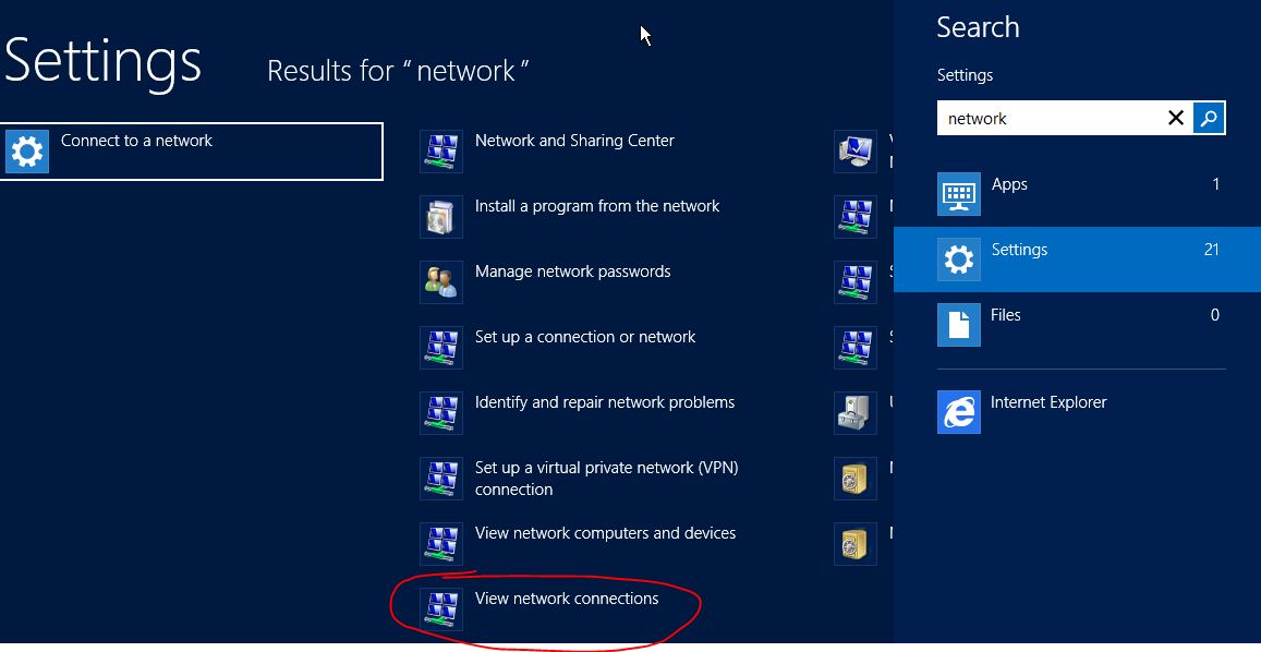
In order to get to anything useful, I have to hit a hot corner, go to Settings, type in “network”, then select View Network Connections:
Conclusion
Luckily for admins everywhere, the Metro UI that we see in Server 2012 is only a fraction of what Windows 8 users will be facing. While I’m not happy about the lack of a Start menu and the clunky hot corner/search style, it’s much better than it could’ve been.
